

A Book by Its Cover
The Archive Volume 1


Welcome to The Book Reporter’s newest series, The Archive: mini history lessons focused on modernist and contemporary literature (20th & 21st century), featuring people, trends, movements, genres…anything pertaining to the history of books. I hope you like it!
A few weeks ago, I spent the weekend cataloguing and covering my personal collection of first editions with that thin, clear plastic film of the kind you find on books in libraries and rare book stores. I measured, cut and wrapped, tedious but satisfying work that also provided a few uninterrupted hours to pore over book covers, considering their design and marketing functions.
Book jackets are a relatively recent invention, first appearing in the mid-19th century in the U.S. as plain, disposable forms of protection for delicate silk and cloth-bound books. With rising literacy rates, mass book production and advances in color printing, the bindings became simpler and dust jackets more artistic, serving as advertising in an increasingly competitive, and commodified, industry. Publishing houses began hiring artists and designers who experimented with typography, color, composition, illustration, photography and graphics to reflect the mood, genre, content and vibe of a book. There was even a brief period in the 1940s when paperbacks featured dust jackets.
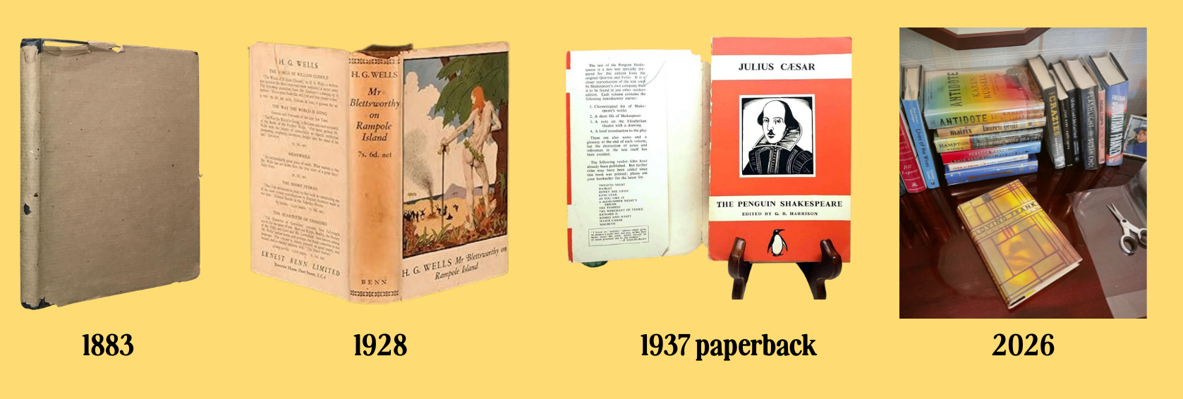
Since then, art and design trends have played out on book covers, from Art Deco to Pop Art to Abstract Expressionism. Today, the collectible nature of first editions has yet again changed our relationship with the book jacket (see, the plastic film as protection for the dust jacket itself) and design continues to evolve, surprise and signify.
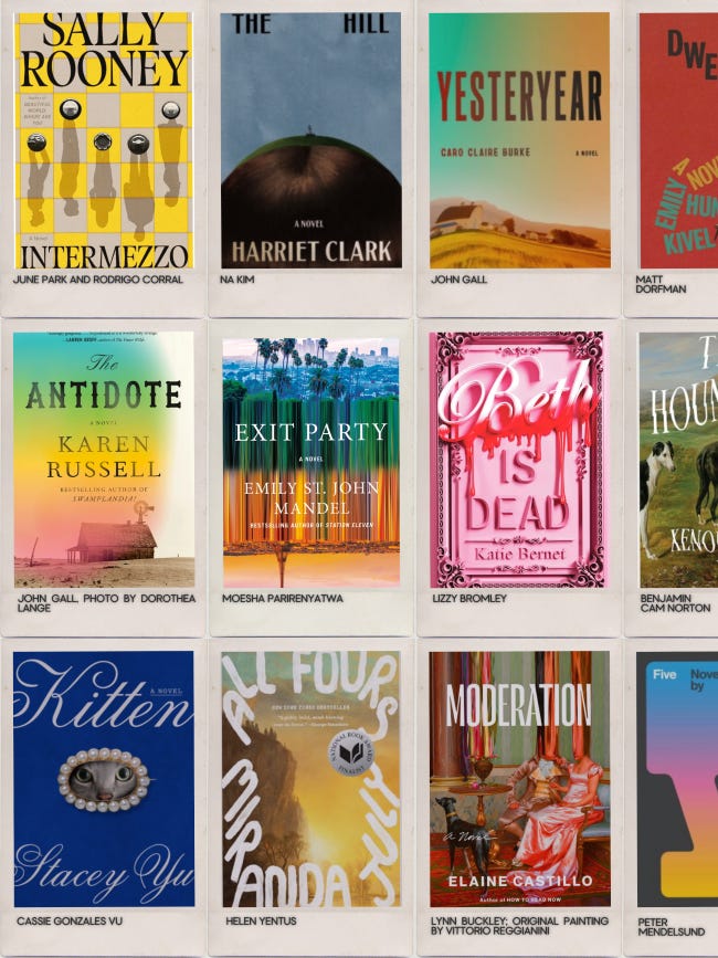
In a sea of ubiquitous Insta-ready genre covers (you can identify most romantasy, thriller or YA from a mile away), there are some standout book designers elevating the craft today. Some recent favorite designs: All Fours (design by Helen Yentus), The Antidote (design by John Gall, photo by Dorothea Lange), Intermezzo (design by June Park and Rodrigo Corral), Kitten (design by Cassie Gonzales Vu), Exit Party (design by Moesha Parirenyatwa), Beth is Dead (design by Lizzy Bromley), Yesteryear (design by John Gall), The Hill (design by Na Kim, giving Julie Curtiss vibes), Moderation (cover design by Lynn Buckley, painting by Vittorio Reggianini) and Among Friends (design by Lauren Peters-Collaer, painting by Bo Bartlett). Regarding these last two, I clearly have not yet tired of the genteel painting trend.
Most of my favorite covers tend to be literary fiction, which, as a genre, seems to lend itself to more creative interpretation than the more prescriptive templates for contemporary nonfiction, romance, crime/mystery, etc. Looking further back, below are some of my favorite iconic designs from ~1970 - 2020. Apparently, I’m biased towards Americana (that tracks) and bowler hats (surprise) but there are many, many more I could have included, so please share your favorite designs in the comments.
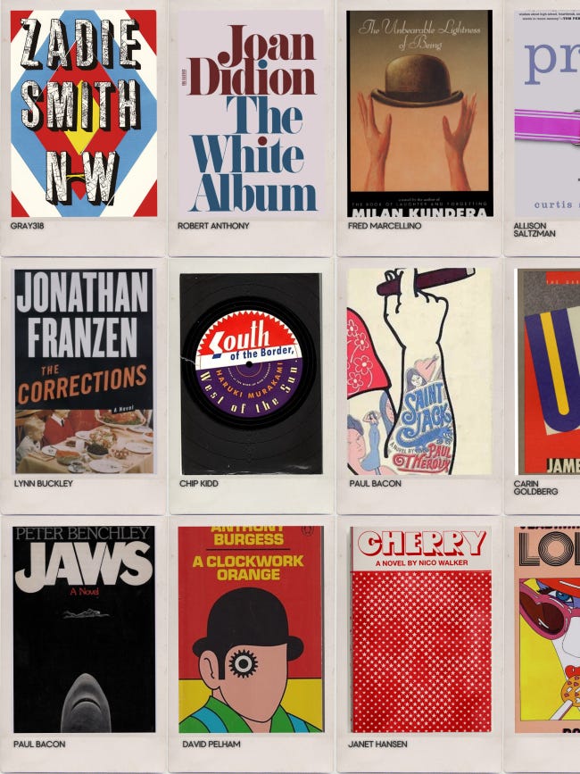
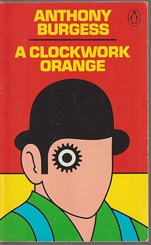
A Clockwork Orange by Anthony Burgess, design by David Pelham, 1972
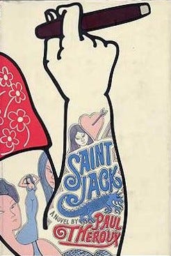
Saint Jack by Paul Theroux, design by Paul Bacon, 1973
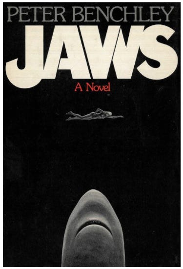
Jaws by Peter Benchley, design by Paul Bacon, 1974
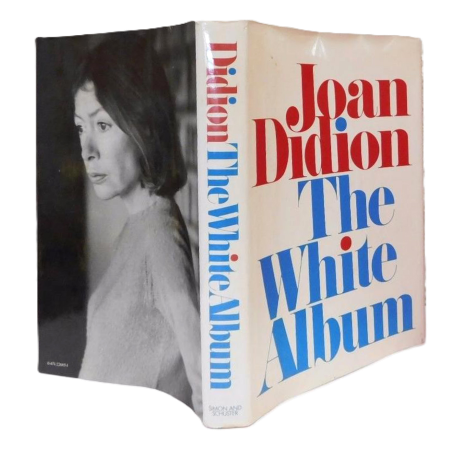
The White Album by Joan Didion, design by Robert Anthony, 1979
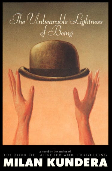
The Unbearable Lightness of Being by Milan Kundera, design by Fred Marcellino, first edition paperback 1985
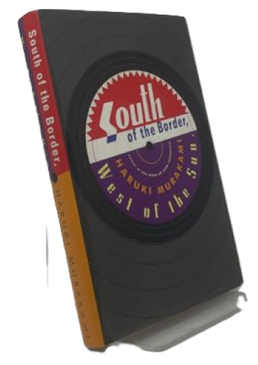
South of the Border, West of the Sun by Haruki Murakami, design by Chip Kidd, first English edition 1999
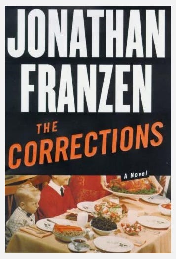
The Corrections by Jonathan Franzen, design by Lynn Buckley, 2001
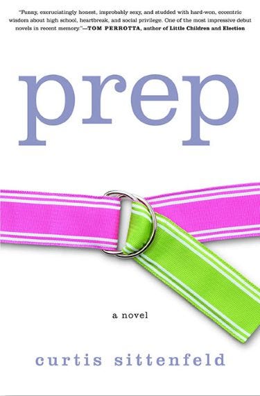
Prep by Curtis Sittenfeld, design by Allison Saltzman, 2005
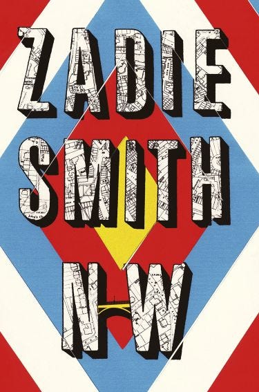
NW by Zadie Smith, design by Gray318, 2012
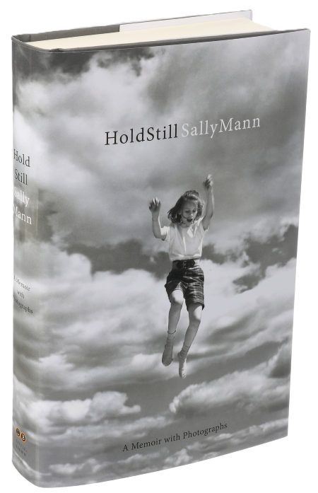
Hold Still by Sally Mann, design by Mario J. Pulice, photo by Robert Munger (Mann’s father), 2015
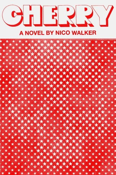
Cherry by Nico Walker, design by Janet Hansen, 2018
One downside of e books and audiobooks - no dust jacket to contemplate and read . Recently realized how much I miss that !
never thought about book cover designers until your great review!